Tuesday, February 15, 2011

Personalizing Patterned Paper

Hi Everyone,

I thought I would show you a neat way to personalize your patterned paper. This is only one of many but it is very simple and very fast.

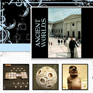
While I was creating my layout I was finding that I liked the look of the Black and White paper but I wanted to add more colour to my design. To fix this situation I changed the white on my paper to a sky blue that I pulled right from one of my photos. This adds a splash of colour and really draws the eye to the central photo on my layout.

For this technique I used the Creative Memories Black and White Power Palette. I find it works best because there are two distinct colours (black and white). The first step is to choose a paper you like (in my layout is is Paper number 4). Then go to your Format Ribbon and click on Filters. You will get a pop up that has a number of effects you can apply to your paper. Click on Threshold. I left my slider bar setting at 128 and just focused on my colours. There are two boxes with colour in them, a low colour and a high colour. You can now select any colour you want and make it your low colour or your high colour. Just click on the drop down menu beside each box and either select a predetermined colour or sample a colour from your layout. For my example I sampled a blue from one of my photos and made it the high colour. I left the low colour (black) alone. Now I have a blue and black paper instead of white and black with just a few simple clicks!


Recipe:
Paper- Creative Memories Black and White Power Palette
Fonts- SBC Distressed Typewriter and SBC Stone Inscription
Template- www.Pixels2Pages.net

Thursday, February 10, 2011

Long time, no posts. . .So Sorry!

Hi Everyone,

My sincerest apologies for not posting in months. I don't have any excuses for abandoning my blog.

Lately I have been busy with digital scrapbooking. I have started to get caught up and am now working on pictures from April 2010! I have almost completed my London trip from last year and thought I would share some of my layouts. I have tried out a few new techniques thanks to Pixels2pages.net. If you haven't been to this site I highly recommend it. Inspiration is everywhere!

This first page I am quite proud of. The blueprint came from the Pixels2Pages website (they are no longer allowed to share blueprints as of January 2011) and I just made it my own. I am really pleased how the large picture of Big Ben looks. I don't often cut out certain objects from pictures and play with the softness and opacity but this turned out really nice. I used my wand tool to cut around big ben, then I softened the edge using the filters tool, finally I changed it to Sepia and brought the opacity down so it blended nicely with the background.


This second page is one of my all time favourites. Everything was working in my favour the day this was created. I wanted to try out the Pixels2Pages challenge #33 called Single Photo Collage. I loved this photo I took in St James Park and really wanted to showcase it. This technique was perfect! For full instructions and pictures to go along with them please click on the link above.

Saturday, June 5, 2010

So sweet Sundae Card


Hi Everyone,

Here is a card I made using Just Because Cards. I love how you can mix and match the images to make the cards your own. I wanted to make my own matching envelope so I started with the envelope cut using the fit to page feature then I used the same size for all of my other cuts. This way everything matched.

I knew I wanted to use the sundae image but there isn't a coordinating card with this button so I flipped through the handbook and found a card base I liked (the gingerbread cookie card), chose a coordinating envelope and went from there.

Using the fit to page feature and a 12x12 piece of paper I cut my envelope. The measurements ended up being 6 3/4 inches. I cute my card base and layer at 6 3/4 inches as well.

I decided to try cutting the sundae at 6 3/4 inches too. I wasn't sure if this cut would coordinate with a card size or cut true to size as it didn't have a specific card associated with it. It turns out the sundae cuts true to size so my 6 3/4 inch sundae was huge.

I didn't want to waste paper so I worked around the large size by cutting off the very top stem and leaf layer of the sundae. I just left the cherry on top.

I ran my ice cream layer and card layer through the cuttlebug to add texture. I also added a piece of ribbon around the card layer.

To finish off the card I added stickles to my ice cream for some sparkle and some glossy accents to my cherry.

The sentiment is from a studio g dollar stamp set from Micheal's.

Enjoy,
Cat

Friday, June 4, 2010

Simple hello card from Create A Critter


Hi Everyone,

Here is another card I created with Create A Critter. This one was super simple. From start to finish it took about 10 minutes and all the paper came from my scraps. This card is bright and fun and could be used for any occasion. To finish it off I added some stickles and a button.


Enjoy,
Cat

Saturday, May 15, 2010

Happy Bird-Day Card


Hi Everyone,

Here is a cute little card I made for my girlfriend for her birthday. I wanted used Just Because cards for the card base, layers, and envelope. These were all cut at 4 1/4 inches. To shadow the base layer on the card I cut it twice. Once at 4 1/4 inches and once at 4 1/2.

The bird was cut using Create A Critter. I can't remember the size. Probably around 3 1/2 inches.

The flower is the SU five petal flower punch. I curled the petals around a pencil to add dimension.

To add a bit of interest I added glossy accents to the dotted paper on the layer as well the bird's beak.

To finish everything off the pieces were all inked using Jumbo Java chalk ink. The card base was lightly sanded all over.

All the paper comes from the Close To My Heart Twitterpated collection.

Happy Scrappin,
Cat

Create- A-Critter makes cute layouts too


Hi Everyone,

Here is another post for you all featuring Create A Critter again. This is definitely one of my favourite cartridges and will be for a long time to come. My three girls are in love with all the cute characters and they have so much fun putting together their own creations because the layering system is so easy.

I was browsing the cricut message board and came across this layout by MelissaB and just had to create my own version. I tend to do two page layouts whenever possible so I spread my critters over two pages. This type of a layout is very different for me. I normally have my pictures in hand and design my pages around them. I rarely create a page just for fun and hope that I will have pictures to go with the page.

To make it easier to incorporate pictures I didn't add any photo mats or openings. I thought it would be easier to find some pictures of my kids playing outside or camping and scatter them around the page and not have to worry about sizes and orientation.

My background paper is from a SU Sale-a-Bration paper pack from last year. I loved the pattern and thought it worked perfectly for sky. The rest of the paper is scraps from my stash.


I loved how the layout turned out and it gave me a perfect opportunity to take this great cartridge out for a test drive.

Crazy about Create a Critter!


Hi Everyone,

I am so sorry I have been MIA lately. I have been uninspired in the crafting department lately. That is until I got my Create a Critter cricut cartridge in the mail! This cartridge is adorable and I have had so much fun creating shaped cards. The cuts are unbelievably easy to put together and I am able to create a unique shaped card in a matter of minutes.

Here are few that I have made recently. The little frog is by far my favourite. This little guy is so cute. To create these cards I weld the base image in Design Studio. Then I cut out a shadow to adhere to the back and front of the card. This way you get a nice even shape and hide the folded edge.

I finish it off by adding the various layers, some pen work, stickles, and buttons. Finished in no time and the cards really pack a punch.