As many of you know I absolutely love Storybook Creator Plus (SBC+). I also love templates. They make digital scrapbooking super fast and easy. The only issue I have had up until lately has been that the free digital templates on the web have not worked with SBC+. SBC+ uses .page files for their pages instead of jpg.
I received an email from Elise, a wonderful lady and fellow digital scrapbooker. She gave me a few tips on how to change a regular jpg template into a SBC+ template that could be altered and embellished with ease. I thought this was such a creative way to make digital templates usable in SBC+ that I wanted to share the process with all of you.
First I went to www.pagemaps.com and found a jpg digital template I liked. This is a fantastic site for templates. You can use them digitally or traditionally. I highly recommend a visit.
I saved the jpg image to my hard drive in a folder specifically designated for such things so I could find it easily.
I imported the image into SBC+ just like any other digital paper. To do this, open SBC+, click on "My stuff" in the top left hand corner of your screen, (at this point I created a "templates" folder in SBC. I thought this would be the easiest way to find them). To create a template collection in "My Stuff" go to "File", then "Add Collection". I named my collection "templates". Once you have created a "templates folder" highlight it and click on "content", "add paper". A window will pop up and you can navigate through your folders until you find the jpg templates you saved earlier. Add you jpg templates into SBC+.
Now that your templates are saved you can either open up an existing storybook or create a new one for templates. Once your project is open, select the jpg image from your paper menu and make the template your background.
Then you will highlight the whole thing. Right click and "unlock" the background. In order to manipulate this jpg image you will need to "flatten" it. To do this you can right click and select "flatten".
Then use your "tools"(straight, rectangle, ellipse, shapes, custom, and wand) to "cut around" the elements in the image. Select the tool that will let you copy the exact image you want to cut and zoom in to insure accuracy. For example if you have a photo box in your jpg then select the rectangle tool and zoom in. Make your rectangle as close to the size and shape as the one in the jpg. Once your rectangle is as close as possible make sure your shape is highlighted, not shaded and select "cut around the shaded area".
Now you will have two pieces to your jpg (the small rectangle and the rest of the background). Make sure the "shape" is highlighted (usually the entire background and the shape are selected.) Once you have the shape by itself then flatten it. Do this for all the shapes on your template using the various tools.
Once you are done, you will have a template that you can drop pictures or paper into. In order to make the template even more user friendly I added empty photo frames (select the photo tool bar, "add new photo frame") and made them the exact same size and placed them directly over top of the photo boxes in the jpg.
To make the empty photo frames the same size as the existing photo boxes in the jpg select the empty photo frame then the jpg photo box. Now right click, select "sizing" and "make the same size". While both elements are selected right click again and select "align", "middle", and "center". Now the elements will be stacked on top of one another. You can now select the jpg element only and delete it. Repeat this step with all of your photo boxes. When you are done you will have empty photo frames to drop pictures into. This extra step is worth it because you can manipulate your photos within the frame. If you skip this step cropping your photos to fit in the boxes can be tricky. Trust me, it is worth doing this extra step.
I did the same thing to add my journaling boxes. Cut around the journaling box in the jpg template and flattened just like all of the other elements. Then add a text box using SBC+ (select the "text" toolbar and "insert text" "place text on the page"). Select the SBC+ text box and the flattened journaling box on the jpg image. Make them the same size. Align them so they were on top of one another. Delete the flattened journaling box so all you are left with is the SBC+ one. This is the exact same process you just used to get your empty photo frames the right size, shape, and place on your layout.
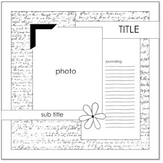
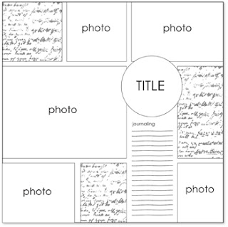
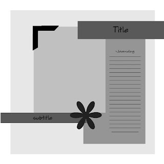
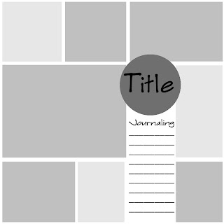
After you do all that you will notice that what was once your background is now a shape with a bunch of holes in it. This causes problems when you go to manipulate your SBC+ template. To solve this problem select your background and delete it. Now you are left with an empty background for your elements and can fill this background with any colour or digital paper that you would like. To fill it with a digital paper simply select the paper you want and click "make background". Here are two examples of jpg images that I downloaded from pagemaps and my SBC+ manipulated templates.
These instructions may seem daunting and some of you may be wondering if it is all worth it. In my opinion it is! There are quite a few steps but they are all very quick. I cleaned up these templates in about 10 minutes from start to finish and now I have two layouts that I can use over and over again. Well worth it!
Here are the two pages I downloaded from pagemaps.


Here is what I ended up with after playing in SBC+ for 10 minutes.


Finally here is one of the templates that has been used as the base for a scrapbook page. This page took me approximately 15 minutes to create.

If anyone has any questions please don't hesitate to email me. I would love to help people out any way I can.
Thanks for looking and happy crafting,
Cat


