Thursday, February 25, 2010

All Things Stamping over at Practical Scrappers

Hi Everyone,

This week over at Practical Scrappers we are working on anything having to do with stamps. Do you know any techniques that will allow you to use your stamps in a new and different way? By using a wide variety of stamping techniques you can achieve many different looks and therefore get more mileage out of your stamps, saving you money! It is always a good thing when I can use something from my scrapbooking supplies instead of picking something up at the store.

This week I chose to share two different techniques with you. The first technique is called the "Kissing Technique". This was the first time I had ever used this technique but I really like the look so it will become a staple in my stamping library. For this technique you need two stamps. One needs to be a solid image stamp, the other needs to be a stamp that will add texture or patterns. Take your solid image stamp and ink it up with a light coloured ink. Then take your texture stamp and ink that up with a darker ink. Now press or "kiss" your stamps together. The dark ink will transfer onto your solid image stamp giving you a two toned stamped image. Now all you need to do is press your solid image stamp to your paper! Voila! Two colours, one stamp!
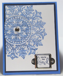
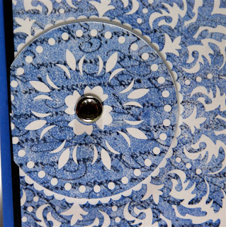

An alternative to this technique is to leave your textured stamp clean and dry when you press it to your solid stamp. In this case your textured stamp will pull some of the ink off of your solid stamp leaving you with a very soft and subtle two toned effect.

The second technique I would like to share is called the "popping pastels" technique. With this technique you need a versamark pad and chalks. It works best on light coloured cardstock. You stamp your image using versamark on light cardstock then rub chalks over your image. The chalk sticks to the versamark but not to the cardstock. You end up with a soft muted stamped image.
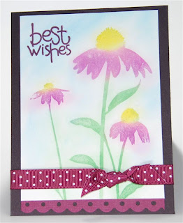

An alternative to this technique is to use black cardstock and white pigment ink that takes longer to dry. Then you rub your chalks over the image. This creates the look of chalk on a chalkboard. It almost looks like your image is glowing. Very cool as well.

I encourage all of you to give these techniques a try and post your results here. I would love to see your beautiful creations.

Enjoy,
Cat

Wednesday, February 24, 2010

Removing Colour from pictures


Hi Everyone,

Over at "The rest of the Storybook" Jan is teaching everyone how to remove colour from a portion of their pictures. For step by step instructions hop on over to her blog. This is such a fantastic technique and gives a really cool look. I decided to try my hand at this for a title bar I am creating for a traditional layout.

I wanted to create a title bar that was 6 inches wide and 12 inches long using one of my pictures. My idea was to turn the picture to black and white and just leave a portion of the tower coloured. Then I wanted to add my title along the entire length of the picture. I have never done anything like this before but am pretty pleased with the results. Now all I need to do is print the picture off and add it to my traditional 12x12 layout.

As soon as I get this title bar printed and added to my layout I will share my completed project with you. In the mean time here is a look at the title bar.


Enjoy,
Cat

Thursday, February 18, 2010

Practical Scrappers Challenge- Flowers!


Hi Everyone,

This week at Practical Scrappers we were supposed to design a project using flowers. I didn't have any prima flowers and really hadn't used my Life's A Beach Cartridge for much so I thought I would create a card using the card feature on Life's A Beach. I loved my shaker card from a couple of weeks ago and wanted to try another one.

Here it is! I hope you enjoy the card. It is simple, fun, and summery. Perfect for a summer bbq or birthday party.

Thursday, February 11, 2010

Practical Scrappers Challenge- Brads!


Hi Everyone,

The challenge for this week over at Practical Scrappers is to use brads on your project. Well, I definitely do not have a shortage of these little gems in my stash! I have no idea where they all came from but I really need to make more of an effort to use them. I use the round brads on a regular basis but find it difficult to use the shaped ones.

For this challenge I pulled out some heart brads that have been sitting in my stash for well over a year and have never been used. I used them to create a border along the bottom of my card. Then to add a bit more bling I added some crystal stickles to the top of each one. Very simple and easy.

Recipe:
Paper- SU Whisper White Cardstock, SU Old Olive, Coordinations Pink cardstock (not sure of the name)
Ink- SU Old Olive, Rose Red, CTMH Chocolate
Stamps- CTMH Grown With Love, Studio G for the sentiment
Accessories- SU Scalloped Circle Punch, CM large circle punch, SU Paper Piercer and Mat Pack, Crystal Stickles, Cuttlebug Swiss Dots Folder

Thursday, February 4, 2010

Practical Scrappers Challenge: Die Cutting Machines!


Hi Everyone,

The challenge this week over at Practical Scrappers was to create a project using any type of die cutting machine. There are tons of great projects and I encourage you to head on over and take a look.

This week I created a shape card using my cricut machine. My daughter loves The Wiggles and for her birthday I made her a "Wiggles" shaped birthday card. To make this card I cut out 2 paper dolls from the Everyday Paper Doll cartridge. Then I cut a small rectangle of paper out of the same skin tone paper I used for the paper dolls. I folded the rectangular piece in half and attached it to the top of the paper dolls. This created a hinge and attached the two paper dolls together forming a portrait style card. Now if you were really talented you could use your Design Studio or Gypsy to weld your shapes together. I opted to go the easy route because my Design Studio skills are not up to par.


Here are a few pictures so you can see how the two paper dolls are attached. As you can see, once you add all of the layers you really can't see the hinge that is holding the dolls together unless you look closely.

All the pieces I used to decorate my paper doll came from the Everyday Paper Doll cartridge as well. I just went through the booklet looking for things that I could use to make a "Murray Wiggle" band member. The Everyday Day Paper Doll cartridge is perfect for this because you can mix and match creating any look to meet your needs. I always like to ink my cricut cuts to make them stand out and give them dimension. This small step really makes a big difference.

Recipe:
Paper- Various pieces of cardstock from my stash
Ink- Jumbo Java Chalk Ink, Niagara falls chalk ink, archival black ink
Stamps- Studio G stamp
Accessories- Cricut, Everyday Paper Dolls Cartridge

Thanks for stopping by,
Cat

Wednesday, February 3, 2010

Serendipity!


Hi Everyone,

I was playing around with some of my supplies trying to get my card done for Practical Scrappers next week and nothing seemed to be working. I tried all sorts of punches and stamps but I couldn't get my card to look the way I had envisioned. Finally I decided to go in an entirely different direction. Success! My card for Practical scrappers is done but now what do I do with all the scraps?


Well that is where Serendipity comes in! I just started playing around with various left over elements from my Practical Scrappers card and I ended up with the cutest little Valentine. It was definitely a "fortunate accident".

I am planning on giving this card to my daughter so she can take it to school for her valentine fundraiser.


Recipe:
Paper- Scrap cardstock (SU and Coordinations, Patterned paper in centre from My Minds Eye
Ink- SU Cameo Coral and Rose Red
Accessories- SU Five Petal flower punch, SU small circle punch, Sizzlets leaf die, SU ticket corner punch, skittles, crystal stickles, left over cover for a build a brad

Tuesday, February 2, 2010

Addicted to Photo Masks.

Hi Everyone,

Okay, it only took me creating one mask and now I am hooked! Here is a second mask that I created today.

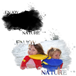
For this one I was going for a more grungy look. I didn't want to use any flourishes. I used a lot of paint splashes, and strokes around the outside of my photo box.

Here is what my mask looks like with and without a picture.


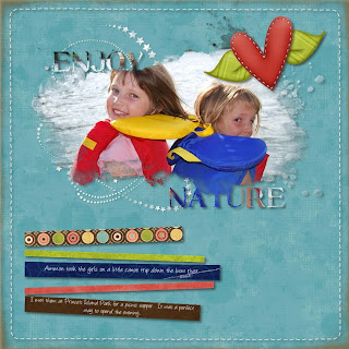
Here is what it looks like on a completed page.


Here is the right hand page of my double page spread. I tried something new with this page as well.

For this page I wanted to continue using the softer outline on my photos to help bring the same feel as the photo mask. I created a collage of photos then softened the edge of all of them. Then I changed the opacity of the photos to about 80%. When they were placed how I wanted them I flattened each photo individually so I could soften the edges even more using the "filters" tool on the format ribbon. When that was done I flattened all the photos together as one single element then used the soft edge filter again. This gave me a nice soft edge around the entire photo collage. I really like how the photos blend into one another.


To make the collage look a bit more like the photo mask on my left hand page I added a few of the paint spatters around the edge of my collage. I changed the opacity on the paint spatters to so they would blend with my collage better.

Recipe:
Paper- Ettes and Company Wonderful World Collection
Accessories- Ettes and Company wonderful World Collection, Stitched page overlay freebie, and vintage page overlay from designer digitals.
Fonts- Angelina, and SBC Stone Inscription

Thanks for taking a look! I would love to see the masks that you all have created. Please leave a comment with a link to your creation.

Cat

Monday, February 1, 2010

My First Digital Mask

Hi Everyone,

I have used photo masks on a few of my layouts and love the look of them but I have never actually created my own before. I was always told they were easy but really didn't believe anyone when they said that. You know what? They are easy! This mask probably took me about 15 minutes to make and I really didn't have a clue what I was doing.

I started out with an empty 4x6 landscape photo frame. I altered the photo frame using the Format Photos ribbon, then selecting "select", then "cutouts" from the drop down menu. I chose the "rustic" option. This gave my photo opening a soft wavy edge.

After that I added a few swirls, paint splatters, and a title. I put a really slight grey glow under the two swirls and I think I added the frosted glass filter to give a slightly grainy texture to them (can't remember now). Once I added all my layers I changed everything to black. Then I selected everything on the page and flattened it so I was one piece.

Now came the interesting part. I picked a number of pictures and tried inserting them into the photo mask. Some of them worked better than others. I had to play around with the cropping to get my photo where I wanted it. You have to remember your photo will always fill the mask starting with the top left corner of the photo so you will need to play with it to get your subject centered.


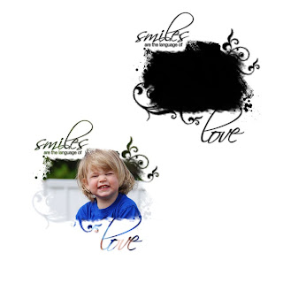
Here are some pictures of the mask without a photo and with a photo.


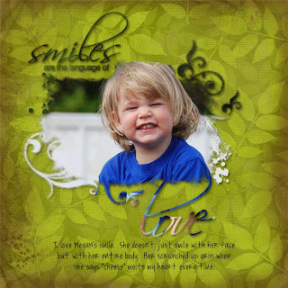
Here it is on a finished page.

If you any questions please don't hesitate to email me or leave a comment. I would love to help you. This mask was so much fun to do and I can't wait to try more.

Thanks for stopping by,
Cat