Saturday, June 5, 2010

So sweet Sundae Card


Hi Everyone,

Here is a card I made using Just Because Cards. I love how you can mix and match the images to make the cards your own. I wanted to make my own matching envelope so I started with the envelope cut using the fit to page feature then I used the same size for all of my other cuts. This way everything matched.

I knew I wanted to use the sundae image but there isn't a coordinating card with this button so I flipped through the handbook and found a card base I liked (the gingerbread cookie card), chose a coordinating envelope and went from there.

Using the fit to page feature and a 12x12 piece of paper I cut my envelope. The measurements ended up being 6 3/4 inches. I cute my card base and layer at 6 3/4 inches as well.

I decided to try cutting the sundae at 6 3/4 inches too. I wasn't sure if this cut would coordinate with a card size or cut true to size as it didn't have a specific card associated with it. It turns out the sundae cuts true to size so my 6 3/4 inch sundae was huge.

I didn't want to waste paper so I worked around the large size by cutting off the very top stem and leaf layer of the sundae. I just left the cherry on top.

I ran my ice cream layer and card layer through the cuttlebug to add texture. I also added a piece of ribbon around the card layer.

To finish off the card I added stickles to my ice cream for some sparkle and some glossy accents to my cherry.

The sentiment is from a studio g dollar stamp set from Micheal's.

Enjoy,
Cat

Friday, June 4, 2010

Simple hello card from Create A Critter


Hi Everyone,

Here is another card I created with Create A Critter. This one was super simple. From start to finish it took about 10 minutes and all the paper came from my scraps. This card is bright and fun and could be used for any occasion. To finish it off I added some stickles and a button.


Enjoy,
Cat

Saturday, May 15, 2010

Happy Bird-Day Card


Hi Everyone,

Here is a cute little card I made for my girlfriend for her birthday. I wanted used Just Because cards for the card base, layers, and envelope. These were all cut at 4 1/4 inches. To shadow the base layer on the card I cut it twice. Once at 4 1/4 inches and once at 4 1/2.

The bird was cut using Create A Critter. I can't remember the size. Probably around 3 1/2 inches.

The flower is the SU five petal flower punch. I curled the petals around a pencil to add dimension.

To add a bit of interest I added glossy accents to the dotted paper on the layer as well the bird's beak.

To finish everything off the pieces were all inked using Jumbo Java chalk ink. The card base was lightly sanded all over.

All the paper comes from the Close To My Heart Twitterpated collection.

Happy Scrappin,
Cat

Create- A-Critter makes cute layouts too


Hi Everyone,

Here is another post for you all featuring Create A Critter again. This is definitely one of my favourite cartridges and will be for a long time to come. My three girls are in love with all the cute characters and they have so much fun putting together their own creations because the layering system is so easy.

I was browsing the cricut message board and came across this layout by MelissaB and just had to create my own version. I tend to do two page layouts whenever possible so I spread my critters over two pages. This type of a layout is very different for me. I normally have my pictures in hand and design my pages around them. I rarely create a page just for fun and hope that I will have pictures to go with the page.

To make it easier to incorporate pictures I didn't add any photo mats or openings. I thought it would be easier to find some pictures of my kids playing outside or camping and scatter them around the page and not have to worry about sizes and orientation.

My background paper is from a SU Sale-a-Bration paper pack from last year. I loved the pattern and thought it worked perfectly for sky. The rest of the paper is scraps from my stash.


I loved how the layout turned out and it gave me a perfect opportunity to take this great cartridge out for a test drive.

Crazy about Create a Critter!


Hi Everyone,

I am so sorry I have been MIA lately. I have been uninspired in the crafting department lately. That is until I got my Create a Critter cricut cartridge in the mail! This cartridge is adorable and I have had so much fun creating shaped cards. The cuts are unbelievably easy to put together and I am able to create a unique shaped card in a matter of minutes.

Here are few that I have made recently. The little frog is by far my favourite. This little guy is so cute. To create these cards I weld the base image in Design Studio. Then I cut out a shadow to adhere to the back and front of the card. This way you get a nice even shape and hide the folded edge.

I finish it off by adding the various layers, some pen work, stickles, and buttons. Finished in no time and the cards really pack a punch.

Monday, April 12, 2010

Pages 2 Pixels - Picture Globe


Hi Everyone,

Sorry I have been MIA as of late. I have been busy with family events as well as training for my second Marathon which I will be running May 30. We are just getting into the hardest part of my training and I haven't really been taking much time to scrapbook or create.

Well I was wandering the web today and found some great pages that were created using SBC 3.0. These very cool pages lead me to a fantastic website that is still in the Beta Testing stage but well worth a peek. The webiste is called Pixels 2 Pages. It is a site that was created by a number of CM consultants worldwide. They are overflowing with talent and have put together a great resource so we can learn all the neat tips and tricks of SBC 3.0.

One of the tutorials they have on their site is how to create a picture globe. You end up with an eye catching way to display your photos.

I decided to try creating one myself. I am pretty pleased with how it turned out! These pictures were taken on a cruise my hubby and I went on last year.

For more information, a video, and step by step instructions on how to create a picture globe visit Pages 2 Pixels. You won't be disappointed!

Friday, March 19, 2010

Vacation Memories


Hi Everyone,

Well it has been a year since my hubby and I went on the vacation of a lifetime and I am just getting to scrapbooking the photos now. I wanted to scrapbook my photos in order so it has taken me awhile to get caught up. Then once I was caught up I was intimated about scrapbooking the pictures. This trip was amazing and I really want to do the pictures justice.

Anyway, here is a double page spread I did on our stop in Agadir Morocco. I used a template from the CM simple start CD. I believe it is from the Decorative Click and Fill series. All of the papers come form the Jewel Power Palette and Jewel Vacation Digital Kit. I love these colours and they work so well with the photos. I really didn't do anything special with this layout. I simply just use my papers to "Click and Fill". Super easy and super fast. If you haven't purchased this CD yet I highly recommend it.


Enjoy,
Cat

Wednesday, March 17, 2010

Giving the Black and White Power Palette Another Chance.


Well, I decided to give the CM Black and White PP another chance. I was careful this time to pick photos with the Black and White PP in mind. I wanted something where the photos were colourful but not too busy. I chose a predesigned layout and made some minor changes.

Thanks so much to whoever made the suggestion to choose one accent colour to go with my Black and White layout. I think this makes a world of difference. I also took the time to get rid of any extra embellisments no matter how small because the paper is so busy all by itself. Finally I changed some of the papers so they had smaller patterns instead of large flourishes.

I hope you like this layout as much as I do. I am very happy with how it turned out. Looking at these pages really bring me back to our wonderful vacation.

Enjoy,
Cat

Wednesday, March 3, 2010

Creative Memories Black and White Power Pallette


Hi Everyone,

Here is a layout I completed over the weekend. I recently purchased the Black and White Creative Memories Power Pallette and then I wasn't sure if I liked it or not. I am having trouble using it since it is a little more "grungy" then I was expecting. If I had looked at it closer I probably wouldn't have purchased it. I usually like clean lines and smaller patterns. This package is filled with lots of textures and grungy patterns. It is very bold and busy.

That being said, I really need to give it a chance before I completely give up on it. To get started I went looking for inspiration on the CM digital project website. I decided to scraplift a layout that was on there. CM was gracious enough to include step by step instructions with this layout so copying was extremely easy.

Here is my finished project. I'm still not too sure I am in love with it. It is totally different from my usual style. Sometimes it is good to step out of your comfort zone right? I would love to hear your thoughts on this page. Is it too busy? Should I add something? Take something away? What do you think?

Enjoy,
Cat

Tuesday, March 2, 2010

Practical Scrappers Challenge- Inks and Chalks


Hi Everyone,

This week's challenge over at practical scrappers is to work with any type of chalk or ink. I actually did two cards this week that fit the bill but only submitted one. So I thought I would share my one of my projects early then share my design team submission with you on Thursday.

This card is a completely different style than I am used to. I had an idea in my head but wasn't sure how it would translate onto paper. The card ended up turning out better than I thought.

For this card I used Tattered Angels Glimmer mist in Periwinkle and Bubblegum. To create the masked image I cut out a design at 4" using the Lyrical Letters cartridge. Then I adhered it the design to white cardstock using temporary adhesive. When the design was stuck down I sprayed Glimmer mist in Periwinkle and Bubblegum. I blotted any excess off with a tissue. Then I removed the mask and a lovely design was revealed!

To finish of the card I cut out some butterflies with my Stampin Up beautiful Wings Embosslit. The butterflies were sprayed with Glimmer Mist as well. Finally I stamped a simple sentiment and Voila! A Simple yet elegant card was revealed. I was impressed with how clear the masked image was. I was expecting the lines to be more ragged but they stayed pretty true to the stencil.

This proved to be a great way to use some of my Glimmer Mist I just had to have, yet I never use! I will definitely end up using it more with this style of card.

Enjoy,
Cat

Thursday, February 25, 2010

All Things Stamping over at Practical Scrappers

Hi Everyone,

This week over at Practical Scrappers we are working on anything having to do with stamps. Do you know any techniques that will allow you to use your stamps in a new and different way? By using a wide variety of stamping techniques you can achieve many different looks and therefore get more mileage out of your stamps, saving you money! It is always a good thing when I can use something from my scrapbooking supplies instead of picking something up at the store.

This week I chose to share two different techniques with you. The first technique is called the "Kissing Technique". This was the first time I had ever used this technique but I really like the look so it will become a staple in my stamping library. For this technique you need two stamps. One needs to be a solid image stamp, the other needs to be a stamp that will add texture or patterns. Take your solid image stamp and ink it up with a light coloured ink. Then take your texture stamp and ink that up with a darker ink. Now press or "kiss" your stamps together. The dark ink will transfer onto your solid image stamp giving you a two toned stamped image. Now all you need to do is press your solid image stamp to your paper! Voila! Two colours, one stamp!


An alternative to this technique is to leave your textured stamp clean and dry when you press it to your solid stamp. In this case your textured stamp will pull some of the ink off of your solid stamp leaving you with a very soft and subtle two toned effect.

The second technique I would like to share is called the "popping pastels" technique. With this technique you need a versamark pad and chalks. It works best on light coloured cardstock. You stamp your image using versamark on light cardstock then rub chalks over your image. The chalk sticks to the versamark but not to the cardstock. You end up with a soft muted stamped image.


An alternative to this technique is to use black cardstock and white pigment ink that takes longer to dry. Then you rub your chalks over the image. This creates the look of chalk on a chalkboard. It almost looks like your image is glowing. Very cool as well.

I encourage all of you to give these techniques a try and post your results here. I would love to see your beautiful creations.

Enjoy,
Cat
Wednesday, February 24, 2010

Removing Colour from pictures


Hi Everyone,

Over at "The rest of the Storybook" Jan is teaching everyone how to remove colour from a portion of their pictures. For step by step instructions hop on over to her blog. This is such a fantastic technique and gives a really cool look. I decided to try my hand at this for a title bar I am creating for a traditional layout.

I wanted to create a title bar that was 6 inches wide and 12 inches long using one of my pictures. My idea was to turn the picture to black and white and just leave a portion of the tower coloured. Then I wanted to add my title along the entire length of the picture. I have never done anything like this before but am pretty pleased with the results. Now all I need to do is print the picture off and add it to my traditional 12x12 layout.

As soon as I get this title bar printed and added to my layout I will share my completed project with you. In the mean time here is a look at the title bar.


Enjoy,
Cat
Thursday, February 18, 2010

Practical Scrappers Challenge- Flowers!


Hi Everyone,

This week at Practical Scrappers we were supposed to design a project using flowers. I didn't have any prima flowers and really hadn't used my Life's A Beach Cartridge for much so I thought I would create a card using the card feature on Life's A Beach. I loved my shaker card from a couple of weeks ago and wanted to try another one.

Here it is! I hope you enjoy the card. It is simple, fun, and summery. Perfect for a summer bbq or birthday party.

Thursday, February 11, 2010

Practical Scrappers Challenge- Brads!


Hi Everyone,

The challenge for this week over at Practical Scrappers is to use brads on your project. Well, I definitely do not have a shortage of these little gems in my stash! I have no idea where they all came from but I really need to make more of an effort to use them. I use the round brads on a regular basis but find it difficult to use the shaped ones.

For this challenge I pulled out some heart brads that have been sitting in my stash for well over a year and have never been used. I used them to create a border along the bottom of my card. Then to add a bit more bling I added some crystal stickles to the top of each one. Very simple and easy.

Recipe:
Paper- SU Whisper White Cardstock, SU Old Olive, Coordinations Pink cardstock (not sure of the name)
Ink- SU Old Olive, Rose Red, CTMH Chocolate
Stamps- CTMH Grown With Love, Studio G for the sentiment
Accessories- SU Scalloped Circle Punch, CM large circle punch, SU Paper Piercer and Mat Pack, Crystal Stickles, Cuttlebug Swiss Dots Folder

Thursday, February 4, 2010

Practical Scrappers Challenge: Die Cutting Machines!


Hi Everyone,

The challenge this week over at Practical Scrappers was to create a project using any type of die cutting machine. There are tons of great projects and I encourage you to head on over and take a look.

This week I created a shape card using my cricut machine. My daughter loves The Wiggles and for her birthday I made her a "Wiggles" shaped birthday card. To make this card I cut out 2 paper dolls from the Everyday Paper Doll cartridge. Then I cut a small rectangle of paper out of the same skin tone paper I used for the paper dolls. I folded the rectangular piece in half and attached it to the top of the paper dolls. This created a hinge and attached the two paper dolls together forming a portrait style card. Now if you were really talented you could use your Design Studio or Gypsy to weld your shapes together. I opted to go the easy route because my Design Studio skills are not up to par.


Here are a few pictures so you can see how the two paper dolls are attached. As you can see, once you add all of the layers you really can't see the hinge that is holding the dolls together unless you look closely.

All the pieces I used to decorate my paper doll came from the Everyday Paper Doll cartridge as well. I just went through the booklet looking for things that I could use to make a "Murray Wiggle" band member. The Everyday Day Paper Doll cartridge is perfect for this because you can mix and match creating any look to meet your needs. I always like to ink my cricut cuts to make them stand out and give them dimension. This small step really makes a big difference.

Recipe:
Paper- Various pieces of cardstock from my stash
Ink- Jumbo Java Chalk Ink, Niagara falls chalk ink, archival black ink
Stamps- Studio G stamp
Accessories- Cricut, Everyday Paper Dolls Cartridge

Thanks for stopping by,
Cat

Wednesday, February 3, 2010

Serendipity!


Hi Everyone,

I was playing around with some of my supplies trying to get my card done for Practical Scrappers next week and nothing seemed to be working. I tried all sorts of punches and stamps but I couldn't get my card to look the way I had envisioned. Finally I decided to go in an entirely different direction. Success! My card for Practical scrappers is done but now what do I do with all the scraps?


Well that is where Serendipity comes in! I just started playing around with various left over elements from my Practical Scrappers card and I ended up with the cutest little Valentine. It was definitely a "fortunate accident".

I am planning on giving this card to my daughter so she can take it to school for her valentine fundraiser.


Recipe:
Paper- Scrap cardstock (SU and Coordinations, Patterned paper in centre from My Minds Eye
Ink- SU Cameo Coral and Rose Red
Accessories- SU Five Petal flower punch, SU small circle punch, Sizzlets leaf die, SU ticket corner punch, skittles, crystal stickles, left over cover for a build a brad

Tuesday, February 2, 2010

Addicted to Photo Masks.

Hi Everyone,

Okay, it only took me creating one mask and now I am hooked! Here is a second mask that I created today.

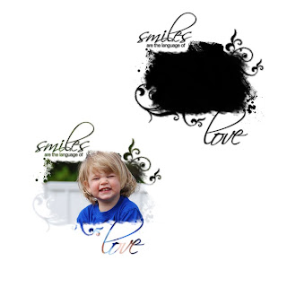
For this one I was going for a more grungy look. I didn't want to use any flourishes. I used a lot of paint splashes, and strokes around the outside of my photo box.

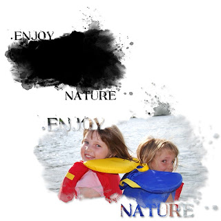
Here is what my mask looks like with and without a picture.


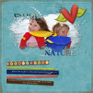
Here is what it looks like on a completed page.


Here is the right hand page of my double page spread. I tried something new with this page as well.

For this page I wanted to continue using the softer outline on my photos to help bring the same feel as the photo mask. I created a collage of photos then softened the edge of all of them. Then I changed the opacity of the photos to about 80%. When they were placed how I wanted them I flattened each photo individually so I could soften the edges even more using the "filters" tool on the format ribbon. When that was done I flattened all the photos together as one single element then used the soft edge filter again. This gave me a nice soft edge around the entire photo collage. I really like how the photos blend into one another.


To make the collage look a bit more like the photo mask on my left hand page I added a few of the paint spatters around the edge of my collage. I changed the opacity on the paint spatters to so they would blend with my collage better.

Recipe:
Paper- Ettes and Company Wonderful World Collection
Accessories- Ettes and Company wonderful World Collection, Stitched page overlay freebie, and vintage page overlay from designer digitals.
Fonts- Angelina, and SBC Stone Inscription

Thanks for taking a look! I would love to see the masks that you all have created. Please leave a comment with a link to your creation.

Cat

Monday, February 1, 2010

My First Digital Mask

Hi Everyone,

I have used photo masks on a few of my layouts and love the look of them but I have never actually created my own before. I was always told they were easy but really didn't believe anyone when they said that. You know what? They are easy! This mask probably took me about 15 minutes to make and I really didn't have a clue what I was doing.

I started out with an empty 4x6 landscape photo frame. I altered the photo frame using the Format Photos ribbon, then selecting "select", then "cutouts" from the drop down menu. I chose the "rustic" option. This gave my photo opening a soft wavy edge.

After that I added a few swirls, paint splatters, and a title. I put a really slight grey glow under the two swirls and I think I added the frosted glass filter to give a slightly grainy texture to them (can't remember now). Once I added all my layers I changed everything to black. Then I selected everything on the page and flattened it so I was one piece.

Now came the interesting part. I picked a number of pictures and tried inserting them into the photo mask. Some of them worked better than others. I had to play around with the cropping to get my photo where I wanted it. You have to remember your photo will always fill the mask starting with the top left corner of the photo so you will need to play with it to get your subject centered.


Here are some pictures of the mask without a photo and with a photo.


Here it is on a finished page.

If you any questions please don't hesitate to email me or leave a comment. I would love to help you. This mask was so much fun to do and I can't wait to try more.

Thanks for stopping by,
Cat

Sunday, January 31, 2010

My Pink Stamper Challenge #3


Hi Everyone,

Here is the final challenge from over at My Pink Stamper. Robyn asked everyone to make a tag. Well I have to admit, I haven't made very many of these so it definitely was a challenge for me.

This weekend I have been focusing on using up my scraps of paper, so the tag along with the two cards I have made used Melon Mambo Cardstock for the base. Hopefully you don't get too sick of this colour before the weekend is through.

I made the tag by cutting a rectangular piece of cardstock out with my trimmer and then used the tag corner punch from stampin up on the two top corners. I added a grommet to the top as well for the hole for the ribbon.

I used my cupcake stamp set from inkadinkado. This is such a cute set and I don't pull it out nearly as often as I would like to. I stamped my cupcake twice. Once on white cardstock and the other on a piece of fancy pants patterned paper. Then I cut out the patterned paper and attached it to the white cardstock so I could have a colourful cupcake wrapper. To finish off the cupcake I put white liquid applique on the top for the frosting as well as some pink glitter (hard to see in the picture). Then I used my heat embossing gun to make the liquid applique all puffy so it looked like frosting.

I added a few pieces of scraps paper to the bottom and popped up my cupcake with dimensionals to finish off the tag.

Recipe:
Paper- SU melon mambo cardstock, white cardstock, fancy pants patterned paper scraps
Ink- Black archival ink, jumbo java chalk ink
Stamps- Inkadinkado cupcake set (sorry I can't remember the name)
Accessories- Melon Mambo Polka dot ribbon, SU jumbo eyelets, liquid applique, heat embossing gun, SU dimensionals, SU tag corner punch


I hope you have had fun participating in the MPS challenges as much as I have,
Cat

Saturday, January 30, 2010

My Pink Stamper Challenge #2


Hi Everyone,

Over at My Pink Stamper Robyn has given everyone another challenge. She has asked everyone to try and create something "warm and springy" to help warm everyone up and beat the winter blahs. She suggested pulling out your Life's a Beach cartridge or something with flowers on it. Well I have to admit I purchased the Life's a Beach cricut cartridge a while ago and I have never used it. It was one of those cartridges I just had to have and I hadn't done anything with it yet.

Well, tonight I actually used it and am quite pleased with the results. I tried out the square card feature and it worked pretty well. I did have a few issues with it. Not sure if it is a glitch in the cartridge or something I am doing wrong (Probably the glitch is in the person working the machine! LOL!).

I cut my square card at 5 1/4" using the mermaid cut. Then I measured the mermaid (she was 3.5") and cut out a base and her layers at 3.5". I had to cut her layers 3 times, in yellow, green, and pink to get all the pieces I wanted in the correct colours. I put my mermaid together then went to put her on the card base and she didn't want to fit quite right. The size seemed to be the same but her arms seemed to be slightly off compared to the square card base (you will be able to see pink outlines where she didn't line up if you look closely). I fiddled with the cut and card base for a few minutes and then decided it didn't really matter in the end.

To jazz up the outside of the card I cut out some seaweed in a variety of sizes and colours to put on the card. I also stamped my sentiment, and added some polka dot ribbon from my stash.

Then I decided I wanted to make this card a shaker card. To do this I attached transparency on the inside of the card (3.5" square). I placed foam tape around the entire opening and added glitter and micro beads (make sure you don't leave any holes or your beads and glitter will fall out). Then I place a 4" piece of water patterned paper over the foam tape. The final step was to add stickles to make it sparkle that much more.

I am really pleased with how well it turned out. I love the shaker cards and the square card feature on this cartridge is perfect for this technique.

Here is the Recipe:
Paper- SU Melon Mambo Cardstock, Water patterned paper (retired) from Creative Memories, Creative Memories cardstock scraps for layers, transparency from Staples
Ink- Archival Black Ink
Stamp- Studio G dollar stamp from Micheal's
Accessories- SU Crushed Curry Polka Dot ribbon, Close To My Heart Foam Tape, silver microbeads, pink and blue fine glitter, Stickles in crystal, green, and yellow

Have fun and stay warm this weekend,
Cat

Digital Layout Ettes Dude Collection


Hi Everyone,

Here is another layout featuring a kit from The Ettes and Company. This collection is called Dude and it is super cute. Perfect for little boy, kid, and outdoor layouts. I really liked the shades of blue in this collection and the monsters are adorable!

The first page of this double page spread is scraplifted from The Ettes and Company design team. I fell in love with the layout and had to recreate it myself. The second page is a live template that I used in my CM Storybook software. I apologize I can't remember where I got the live template from so if anyone recognizes it then please let me know so I can give credit where credit is due.

The only other special technique I used for this double page spread is adding "glitter" to a few of my embellishments (bracket, flowers, and hearts). This is a very simple trick but adds some really nice texture to your page.

To add "glitter" to an element you need to select the element then go to your format ribbon, select "surfaces", choose the first surface (block), and move the amplification bar all the way to the right (10). This should give you a "glitterized" effect. If it doesn't show enough then you can always repeat the steps to get a more grainy texture. Thanks goes out to Macey Goode for sharing this neat trick with the CM Digi scrapping community.

I apologize for the blurred photos but I thought since there were other children in the photo other than my own, and I didn't ask permission to post their pictures I would blur them out.

Have a great weekend,
Cat

Friday, January 29, 2010

Pink Stamper Challenge #1


Hi Everyone,

Robyn aka My Pink Stamper is having a number of challenges throughout the day today as well as tomorrow. The first challenge she has given everyone is to use your favourite colour and black to create something.

I chose to do a card using Stampin Up's Melon Mambo with Black. I love this hot pink colour with black. The black really makes everything pop.

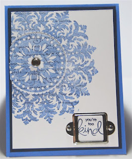
For this card I used my SU medallion stamp and inked it up with Pink Pirouette, then I used my SU markers to colour around the outside with Rose Red Ink (very close to Melon Mambo ink and works as a good substitute). Once that was done then I took a makeup sponge and dabbed all over the stamp to soften the lines.

To finish everything off I added some Cotton Candy Stickles, ribbon, and a rhinestone brad for a little extra bling.

If you want to get your creative juices flowing then head on over to My Pink Stamper and try out one of her challenges.

Recipe:
Paper- SU Melon Mambo, Black, and Whisper White Cardstock
Ink- SU Pink Pirouette, Rose Red, and Archival Black Ink
Stamps- SU Medallion, Heidi Grace Stamp (sorry can't remember the name)
Accessories- Pop Dots, SU rhinestone brad, paper piercer, mat pack, Cotton Candy Stickles, Melon Mambo Polka Dot ribbon.

Happy Crafting everyone,
Cat

My first Ettes and Company Layout.


Hi Everyone,

I shared my first digital card with you yesterday. Well I thought I would show you a layout I just completed with some more Ettes and Company digital collections. This Collection is called "Wonderful World" and is another fantastic collection filled with so many elements and papers that you won't believe the price. I couldn't get over how big it is.

Anyway, I purchased this kit because I love the little characters that are included with them. I think they are so cute and are perfect for cards and scrapbook pages involving kids.

Everything on this page was created from the same kit. The page layout is a "Decorative Click and Fill" page from Creative Memories. I rearranged the layout a bit for the second page of the double page spread so it is similar enough for everything to flow but altered enough to create interest. At least, I hope that is how it turned out since that is what I was going for.

Recipe:
Papers- All papers are from the Wonderful World Collection by Ettes and Company
Accessories- All Elements are from the Wonderful World Collection by Ettes and Company, Decorative Click and Fill page from Creative Memories from the Simple Start CD

Thursday, January 28, 2010

My first Digital Card!


Hi Everyone,

I decided to try out some of my new digital kits I recently purchased and try my hand at a digital card. I have never done a digital card before but thought it might be fun. I am planning on printing the card front and insert out on my printer at home and attaching them to a card base.

I created the digital card so the finished size will be A2 with a .25" border around when I attach it to the card base.

I fell in love with this kit when my friend Lori Bickford shared a digital page on Facebook. The little monsters/aliens are so cute and the colours are perfect for kids layouts.

To purchase this amazing kit and many others at fantastic prices I encourage all of you to head on over to Ettes and Company. These ladies have amazing kits and their prices are super reasonable.

Recipe:
Paper- All digital paper from Ettes and Company Dude Collection
Accessories- All accessories with the exception of the white stitching is from the Dude Collection, White stitching is a freebie from CM
Font- SBC Karen Bear Ultra

Practical Scrappers Challenge - Patterned Paper


Hi Everyone,

I'm sure we are all guilty of hoarding lots of beautiful patterned papers in our scrapbooking stash. I know there have been times when I purchase paper just because I love it, then I don't end up using it because I don't want to waste it. Well over at Practical Scrappers this week they are encouraging you to use up some of your patterned paper stash. The challenge for the designers was to use at least two different pieces of patterned paper on your project. Everyone has done a fantastic job. You should really go and check out their work.

This week I used some valentines themed paper I purchased last year and never used. All the patterned paper for my project this week comes from the same collection by My Mind's Eye. I loved the colours and I really love pink and brown together.

I always have a difficult time combining different patterned papers. I am afraid of things looking too busy or patterns/colours clashing. One way to avoid this is to pick all your patterned papers from the same collection. That way you know all the colours work together as well as the patterns.

I started out with a piece of SU Chocolate Chip cardstock and stamped the "En Francais" background stamp in versamark then heat embossed it.

I added a vellum scalloped circle that was cut with my cricut. On top of that I added a butterfly I created with my SU butterfly bigz die. I inked the edges of both of the cuts to help define them and tie the two pieces of patterned paper together. To finish off the butterfly I added three plastic beads (skittles) from my stash. The bottom is another piece of patterend paper from the same MME collection and a small scalloped border made from a piece of scrap paper. The sentiment is stamped in Chocolate Chip ink and is from a Heidi Grace clear stamp set.


Recipe:
Paper- SU chocolate chip cardstock, rust cardstock scrap (probably CM), white vellum, MME Irresistible collection; Sweethearts, Candy Stripe, and Sweet Blossoms
Ink- SU chocolate chip, jumbo java chalk ink, Versamark
Stamps- SU En Francais, Heidi Grace Wild Daisy Road
Accessories- Clear plastic beads, Paper piercer, Clear Embossing powder, SU scalloped border punch, SU Beautiful Butterflies die

Wednesday, January 27, 2010

Another Reason I Love Working with CM Live Templates.

Hi Everyone,

I apologize for not posting here more often. I have been crazy busy lately trying to put together a storybook in honour of my Grandmother's 80th birthday. I love how it is coming together and everything has been so much easier thanks to CM's live templates.

I wanted this storybook to have a more heritage type feel so I purchased a few kits as well as some predesigned pages through CM. Some of the pages I could use as is and make a beautiful page in a matter of minutes. Other pages just needed a little tweeking and some were a perfect springboard for getting my creative juices flowing.

Today I wanted to show you one of the predesigned pages that came in the "Beautifully Blended" Predesigned page kit before I changed it, and I also wanted to show you my finished project so you could see how versatile these pages can be.

For this particular layout I wanted to feature a number of pictures of my Grandmother with her sister. I really liked the tree embellishment that was on the predesigned page but nothing else really fit with my overall storybook theme.


This is what the page looked like before I did anything to alter it.

To remedy this situation I changed the papers and embellishments to match the other side of my double page layout while leaving the tree alone. Then all I had to do was change the positioning of the tree embellishment and fill the circles around the tree with paper that would match my layout. Now I have a whole new layout that meets my needs but saved me lots of time because I didn't have to start from scratch! If I had had to create this tree embellishment from scratch it wouldn't have turned out nearly as nice. There are so many tiny pieces. I'm glad I can count on the CM designers to come up with amazing embellishments that I can personalize in just a few clicks.


Here is the completed double page layout.

Tuesday, January 19, 2010

Practical Scrappers Challenge- EMBOSSING!


Hi Everyone,

The challenge over at Practical Scrappers this week is embossing. Any kind of embossing will do. You can use heat embossing, dry embossing, cuttlebug, or even pre-embossed paper. It is totally up to you.

The card I created for this challenge featured heat embossing. I decided to try out my new Close To My Heart Stamp set. It was perfect for this technique. I started out with a piece of white glossy cardstock (I tried to cheap out by using photo paper to start with and it didn't work very well.), I stamped my image with versmark ink then covered it with clear embossing powder. When that was done I used my brayer to cover the cardstock with Bashful Blue SU ink. Then I took a makeup sponge and added Brocade Blue ink (SU). Finally I added Close To My Heart Denim ink around the edges. After all my ink was layered on I took a paper towel and "polished" the glossy cardstock. This really made my image pop because the ink sticks to the cardstock but not the embossing powder.

To finish off my card front I stamped the stem using classic dye based ink in Stampin Up Old Olive and stamped my sentiment with CTMH Denim classic ink. At this point I set my card front aside to dry. It does take awhile (around 10 or 15 minutes) for the ink to dry and there is a little bit of bleeding but I really liked the soft look of the finished product. I also added a bit of Crystal stickles for some sparkle.

Finally I mounted the card to a white piece of cardstock and that to a SU Night of Navy cardbase. On the inside I put a white insert and stamped a smaller dandelion image in the bottom right corner to decorate the inside. Very simple, elegant, and fast.

Recipe:
Paper- White cardstock, Night of Navy cardstock (SU), Glossy cardstock by ranger.
Ink- SU Bashful Blue, Brocade Blue, and Old Olive, CTMH Denim, Versamark
Stamps- CTMH Treasures (September 2009 stamp of the month)
Accessories- Clear Detail embossing powder, brayer, heat tool, Crystal Stickles, makeup sponge


Enjoy and have fun crafting!
Cat

Thursday, January 14, 2010

Hybrid layouts

Hi Everyone,


I wanted to share with you one of my first hybrid layouts I recently completed. As you know, I have just started to get into digital scrapbooking. Up until recently I have been doing either completely digital layouts or completely traditional layouts. I have started adding the occasional cricut title, brad, eyelet, or sticker to my digital layouts in an effort to move toward hybrid scrapbooking. I found that I love the added dimension.

The layout I am going to share with you today is even more of a hybrid layout. I started with a digital template that I created in Storybook Creator Plus 3.0. All I did was drag my photos into the template. I didn't add any digital papers or embellishments. In fact I wanted to add some pieces of paper to my finished layout so I left some of my photo spaces blank.


When I had my photos where I wanted them I sent them to the photo printer and had two 8x10 layouts printed. This is what it looked like when I got it back from the printer.


Now I took my patterned paper and used that as the base for my 12x12 layout. All I did was trim my digital layout slightly and add it to my patterned paper. When that was done I chose some coordinating paper to fill in my blank spaces on my template along with some stickers and buttons.


One of the things I love about digital scrapbooking is having the freedom to change my photos to any size I want. The thing I love about traditional scrapbooking is playing with paper, scissors, and glue. Now I can have the best of both worlds by creating hybrid layouts.

Recipe:
Paper- CTMH Back Country level two paper pack
Accessories- Clear craft buttons from CTMH, glossy accents, sandpaper, Opposites attract Cricut Cartridge, CTMH waxy flax in colonial white, epoxy stickers from Walmart (sorry can't remember name), CM Storybook Creator Plus 3.0

I encourage all of you to step out of your comfort zone and try a hybrid layout or two. Good luck and happy scrapping!

Cat